
💖 How to Create “Girl I Need You” Song Edit in CapCut (Typography Edit 2026 Guide)
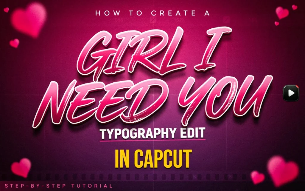
Typography edits — where lyrics animate on screen in sync with a song’s rhythm and emotion — have become a popular reel format, and the romantic Bollywood track “Girl I Need You” (from Baaghi, performed by Armaan Malik and Palak Muchhal) is a common choice for this style. Here’s how to build one in CapCut.
What a Typography Edit Is
It’s a lyric-driven video where the words of a song appear on screen, animated to match the beat and emotional tone of the track — turning a simple audio clip into a more deliberate piece of visual storytelling. The core skill is timing: getting each line’s appearance and animation to land exactly with the vocal.
What You’ll Need
The latest version of CapCut, the song audio (sourced from CapCut’s library or wherever you have rights to use it from), a background clip with a soft, romantic, or cinematic tone (blurred b-roll works well if you don’t have footage that fits), and optionally a reference template if you want to match an existing trending style rather than building from scratch.
Step-by-Step Guide
1. Start a new project. Import a background clip or image with a warm tone or soft blur — a slow-motion romantic stock clip works if you don’t have your own footage that fits the mood.
2. Add the song. Import your audio and trim it down to 15–30 seconds for a Reel or Short. Focus on whichever section of the song carries the most emotional weight for your edit — usually the hook or chorus tends to work best for this kind of format, since it’s the part viewers are most likely to already recognize.
3. Add the lyrics as text. Type out the line you’re syncing to using a clean, modern font — Poppins, Montserrat, or Avenir all suit this style well. Mixing bold and lighter weights, or using all caps for more emphatic lines, can help build visual rhythm across the edit.
4. Animate the typography. This is where the edit comes together. In-animations like a pop, fade-in, or wipe tend to suit lyric reveals well; fade-out or slide-down work for exits. A subtle blink, wave, or zoom-pulse loop can add life to a line that’s holding on screen longer. Set the duration of each line to match its vocal timing precisely — CapCut’s beat markers (auto-detected) make it considerably easier to land this accurately rather than eyeballing it.
5. Add motion and transitions. A slight zoom in or out on the background adds gentle movement without being distracting. Mild camera shake can punctuate an emotional beat. Fade transitions between lyric segments keep things feeling cohesive. For reel-length content, roughly one to two seconds per line tends to keep the pacing quick and engaging.
6. Add light overlays, for a dreamier mood. Lens flare, bokeh, or light leak effects add atmosphere. A blur overlay during transitions or a soft glow/glitter effect can reinforce a romantic tone — keep these subtle enough that they support the typography rather than competing with it.
7. Color grade for mood. Slightly lowering brightness while pushing warmth up, with a soft pink or orange tint, tends to suit a romantic tone — adjust by eye rather than a fixed formula, since it depends heavily on your source footage.
8. Add a signature or watermark, if it’s your edit. A small “@username” text overlay in a corner helps with brand identity and makes it harder for the edit to be reposted without credit.
9. Export. 1080p or 2K at 60fps gives smooth playback for the quick cuts and animations typography edits rely on.
Using a Template Instead
If you’d rather not build the animation from scratch, CapCut’s template section is worth searching for existing typography-style templates matching this trend — you can swap in your own text and clip while keeping the underlying timing and animation work already done for you.
Tips to Make It Stand Out
Slow zoom-and-blur transitions between lyric changes add polish without much extra effort. Varying case — uppercase for more emphatic lines, lowercase for softer ones — helps convey the song’s emotional shifts visually. Keeping text centered or slightly off-center tends to read as more cinematic than dead-center placement on every line. And more than anything, precise timing between the text and the vocal is what actually sells the emotional effect — a beautifully animated line that lands a beat late undercuts the whole edit.
Mistakes to Avoid
Overly decorative fonts tend to sacrifice readability for style, which isn’t a good trade for a lyric-driven format. Animations that don’t actually match the beat read as arbitrary rather than intentional. Poor timing between text and vocals is probably the single most common thing that makes an otherwise well-built typography edit feel off. And using low-quality audio undercuts the whole point of a format that’s built around the song itself.


